
Welcome to a New World of Colour
Our COLOURS AND SPECIAL FINISHES

Extended Gamut
Speedy Print offers a broader range of colour than traditional CMYK printing with our speciality extended gamut ink. Get noticed with brighter, vibrant pinks, oranges, purples and more.

Metallic Inks
Nothing says luxury quite like gold or silver and our speciality metallic inks exude quality. Use them as a spot colour, or as an underlay to add maximum sparkle and sheen to your product.

White Ink
Create a white spot colour that attracts attention, or use it as an underlay to help other colours "pop" on our range of coloured and transparent stocks.
Colour Proofing
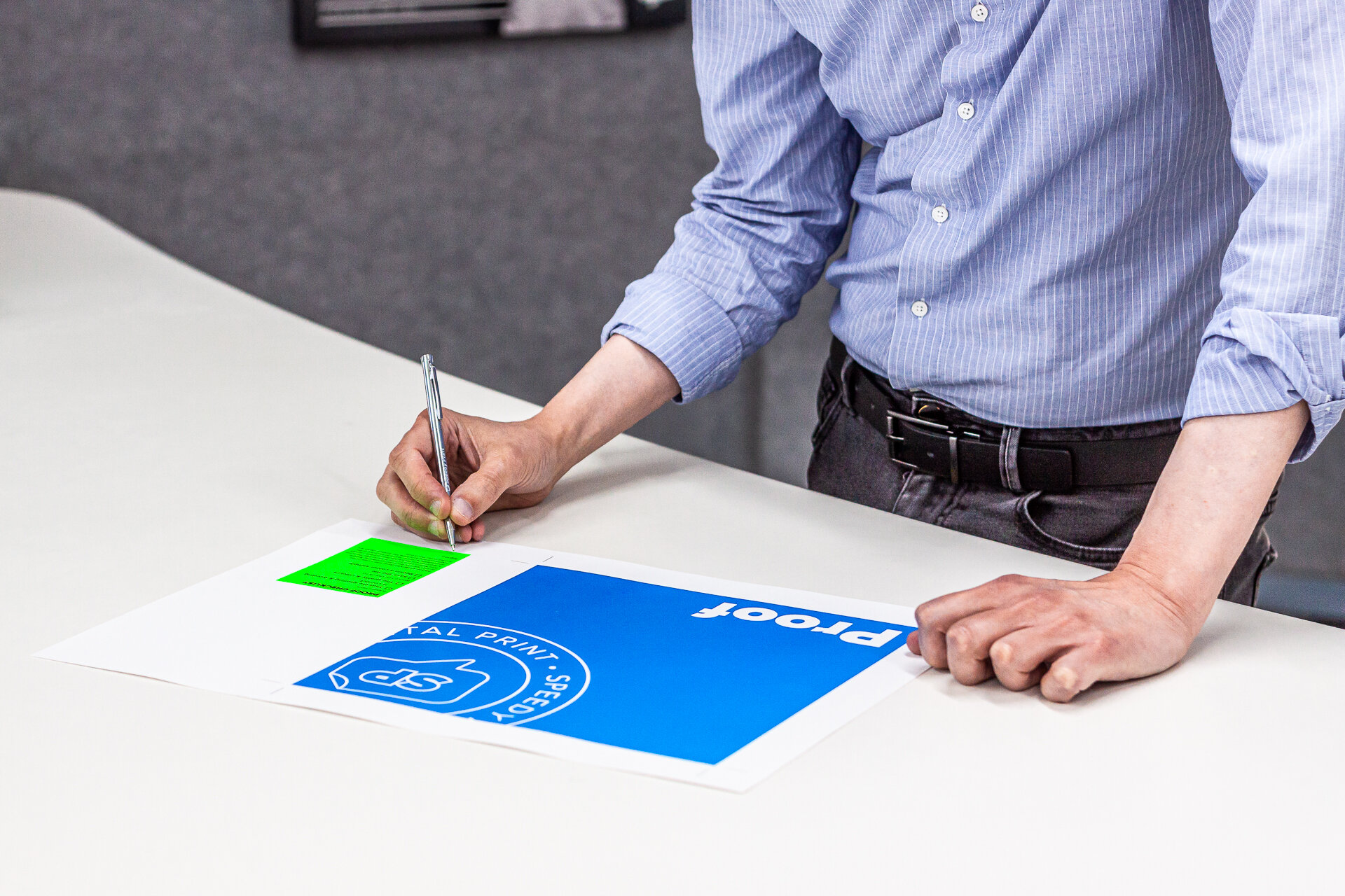
Can I see a proof?
Yes, we can proof your job; please note that there is an addition charge to do this.
Contact our team to discuss your needs.

Why do the printed colours look different from what I see on my screen?
Images displayed on a monitor are created by blending varying intensities of red, green and blue (RGB) light. CMYK prints are produced by combining varying degrees of Cyan, Magenta, Yellow and Key (Black) toner on paper. They are two completely different processes. Additionally, each monitor, software application and printer can interpret and reproduce these colours slightly differently. Therefore, you must adopt a colour managed workflow using consistent colour profiles. This consistency helps give you a more accurate indication of what your project will look like when printed.


D50 Environmental Lighting
At Speedy Print, we’ve set up most of our building to meet D50 lighting conditions so that when you come in to view your printed proofs, you’re seeing an accurate representation of the colour.
ISO 3664:2009 specifies the CIE illuminant D50 with a correlated colour temperature of approximately 5000° Kelvin as the standard illuminant to be used as a light source for viewing and assessing colour for the graphic technologies and photography.
Colour is the result of interaction between light, an object, and a viewer. The sensation of colour is achieved as unique combinations of wavelengths of light are transmitted, reflected, or emitted to the viewer. Since the properties of light are a primary component of colour, and different lighting conditions will produce differences in colour rendition, it is vital that critical colour assessment is conducted within viewing conditions where lighting is standardised, and components affecting the viewing environment are carefully controlled. Colour decisions can only be made and communicated accurately if all participants involved utilise internationally standardized viewing (which includes lighting) conditions.

Our Services

File Prep

Get a Quote